
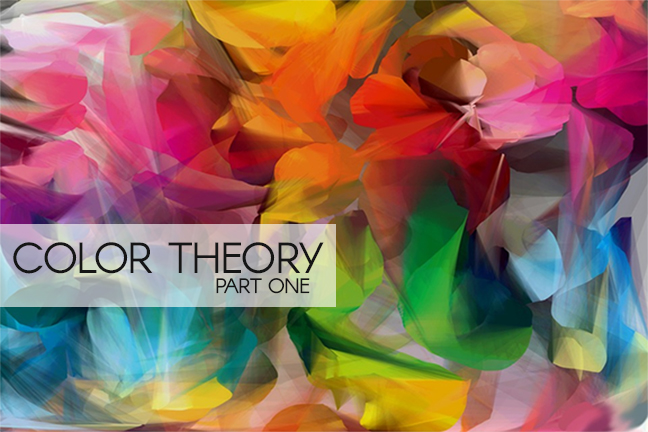
Color is everywhere and is part of everything we visually encounter in the world. Using color for many designers is an intuitive choice, but having a simple understanding of colors can help anyone make more effective visuals. Understanding how color works and how you can use it effectively can benefit you in many ways (design, clothing, home decor, etc). Color theory is a science in itself. Studying how colors affect different people, either individually or as a group, is something some people build their careers on.
This is the first in a three-part series on color theory. First up we will discuss the meanings behind the different color families, look at the colors themselves and how they relate, and see how they can be used in design. In Part 2 I’ll talk about how hue, tones, tints, and shades affect the way we perceive colors. And in Part 3 I’ll discuss how to create effective color palettes for your own designs and see what tools are out there to help you.
Let’s get started with the color basics!
Warm Colors
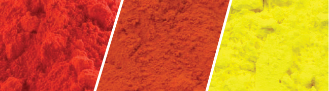
Warm colors include red, orange, and yellow, and variations of those three colors. These colors are reminiscent of fire, sunsets, and sunrises. They are generally energizing, passionate, and positive.
Red and yellow are both primary colors, with orange falling in the middle, which means warm colors are all truly warm and aren’t created by combining a warm color with a cool color. Warm colors are often considered to be vivid and energetic. They are stimulating and connect emotionally to warmth.
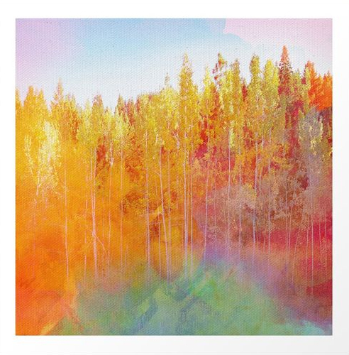
Warm Color example – Enchanted Scenery 2 by Klara Acel
Cool Colors

Cool colors include blues, greens, and purples. These colors remind us of the sky, water, and nature.
Blue is the only primary color within the cool spectrum, which means the other colors are created by combining blue with a warm color (yellow for green and red for purple). Cool colors are thought to be calming, relaxing and reserved.
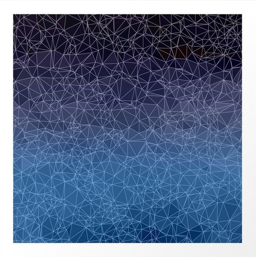
Cool Color example – Polygonal blue, black and purple by VanessaGF
Neutrals
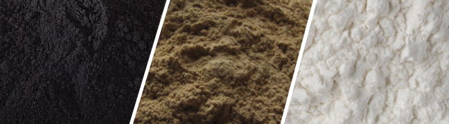
Neutral colors often serve as the backdrop in design. They’re commonly combined with brighter accent colors. But they can also be used on their own in designs. Neutral colors are black, white, grey, brown, beige, tan, cream, and ivory.
There are lots of good reasons to incorporate neutral colors in designs. Having a calm, neutral backdrop allows you to have a pop of color that stands out – using too many bold colors can overpower a design. They can help bring visual balance to your work.
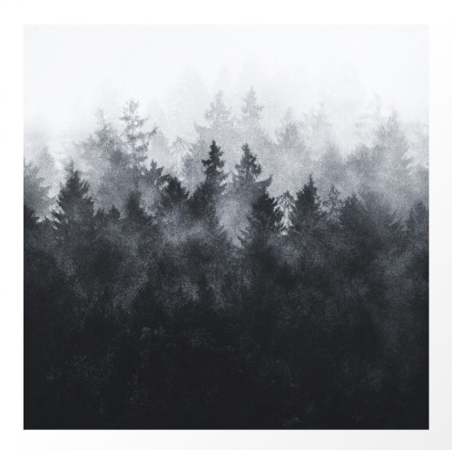
Neutral Color example- The Heart Of My Heart // Midwinter Edit by Tordis Kayma
Color wrap up
Knowing about the color wheel and how these colors are made up and interact with each other is the first step to understanding color theory. You are well on your way to becoming a color expert! If you would like to know more about the basic color theory you can check out this article that has some more in depth explanations. Be sure to check back for part 2 of this series.
{example images from here}
Leave a Reply